On the Records: Per-Capita Money Maps
/https://static.texastribune.org/media/images/govmaps_percapita.jpg)
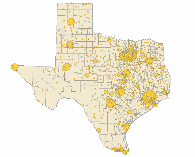
A few people suggested this week that we map per-capita contributions in the governor's race, rather than the percentage of each candidates' overall fundraising total.
The Rick vs. Kay blog wrote of our previous effort:
Somewhat interesting... the only thing is that this might as well be the population density map for Texas... this could be more useful if it matched up against the population density to show which areas gave disproportionately more than others... certain small towns have a greater influence on political money than others...
Ask, and ye shall receive.
First, check out the first map, which visualized the percentage of contributions to Rick Perry, Kay Bailey Hutchison, Debra Medina, Bill White and Farouk Shami by city:
This map, however, shows per-capita contributions. The bubbles get larger as the disparity between population and total donations increases:
For example, the candidates received what amounts to $1.15 from each Houstonian. They received $1 per-resident from Dallas and $2 per-resident from Austin. But check out Blanco, Encinal and Salado. The candidates collected $57, $38, $25 per person there:
One note: The population totals are based on U.S. Census Bureau estimates from 2005 (the best I could do on short notice).
Ideas for more maps?
Texas Tribune donors or members may be quoted or mentioned in our stories, or may be the subject of them. For a complete list of contributors, click here.
Reference
Raw Data: Per-Capita Contributions to Texas Gubernatorial Candidates in 2009Information about the authors
Learn about The Texas Tribune’s policies, including our partnership with The Trust Project to increase transparency in news.


/https://static.texastribune.org/media/profiles/TxTrib-Staff_0016_StilesMatt800.jpg)